3 Steps for Logo Design That Works

Logo design is often neglected when creating a company’s brand. But this is a paramount step that should follow the selection of colors for a brand, and should reflect the business’s main activities.
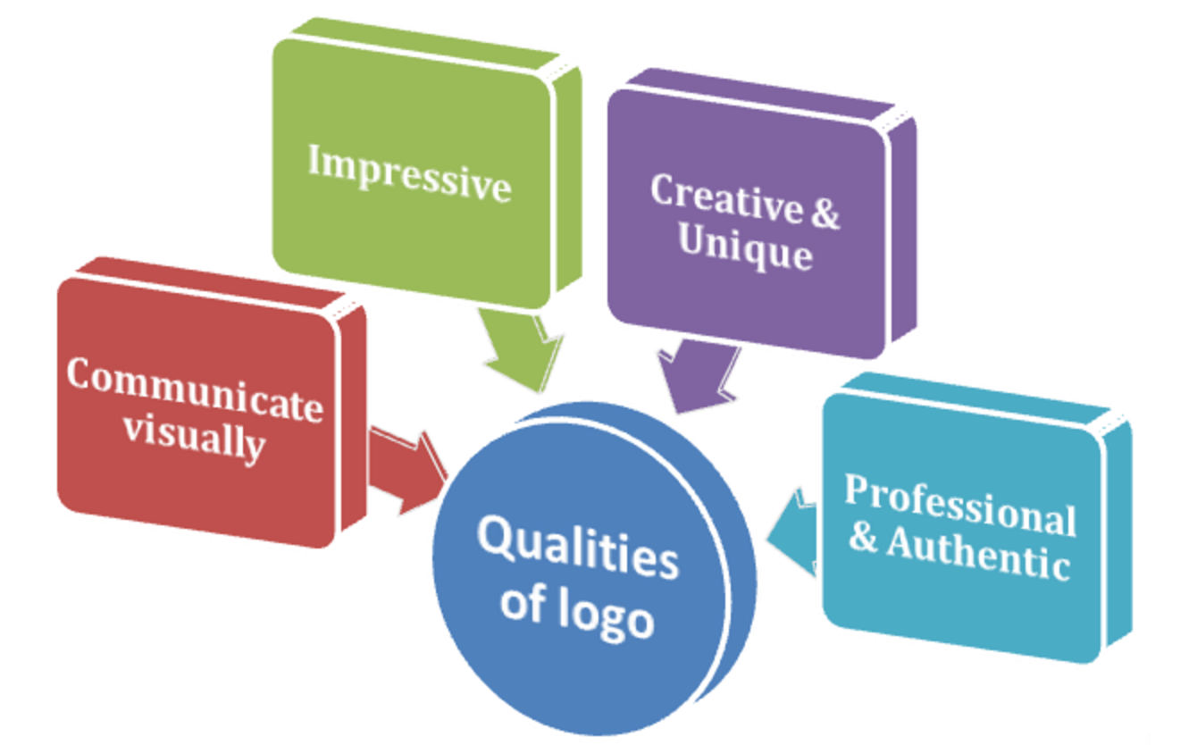
A business’s logo has a strong impact on its audience. A high-quality logo increases brand awareness, attracts new customers, and helps the company profit. Logo design that works can attract customers. When it doesn’t work it can scare them away.
So, the question is not whether you have to design a logo but in what way you have to do it.
There are three stages of logo design that every business should go through.
Stage 1: Planning
The main point in the first stage is to connect the logo and the brand. Do it with the help of colors: select colors that best suit your business. Researching color symbolism and color psychology will help you.
The logo should cause potential customers to associate the logo with your business once he or she sees it. It should be clear and readable at any size whether it is portrayed on business cards or the side of a truck.
Stage 2: Designing
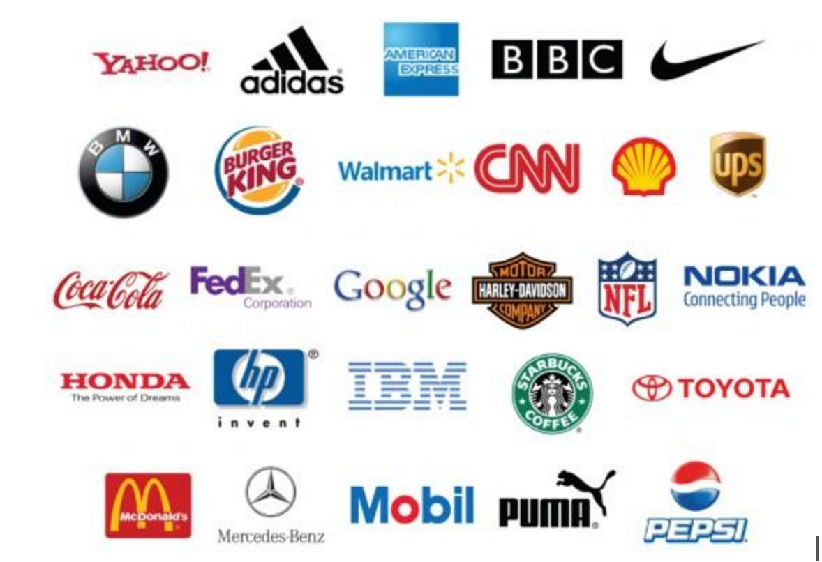
Look at logos of world-known companies and consider how simple they are: nothing is convoluted or bizarre. Analyze your competitors’ logos, but don’t copy them. You may be inspired by studying other people’s ideas, and even may begin to form a unique image in your mind of your logo based on of what you see.
There are three basic types of logos:
- Character-Based – a character used to depict a business abstractly (i.e. Puma and Starbucks).
- Font-Based – a company name written in a specific font (i.e. Coca-Cola, Yahoo, and Google).
- Image-Based – an image used to represent a brand (i.e. Adidas, BMW, and Pepsi).

The simplest way to analyze the pros and cons of logos is to use Google Image Search to search for logos for businesses in your industry. Find logos you think are successful and unsuccessful and then try to make a sketch on paper of your logo.
Next, impartially evaluate the drawing as if it was painted by someone else. Do not rush to develop your logo immediately based solely on trendy design elements.
Ask friends or colleagues what they think about your ideas. Ask them about the attractiveness of the sketches you’ve created. Listen to everything everyone says in order to refine your design.
Some things that you would never pay attention to may be valuable for others. Remember: your logo is not for you. It is for your customer. Write down all of the feedback you get, review your options, and choose the most relevant one, relying both on the comments and your own intuition.
Stage 3: Development
When it comes to actually developing your logo, though the creation of the logo is individual in each case, there are some general rules to consider:
- Style: There’s sometimes a desire to create an ultra-modern logo. But in fact, such a logo will become obsolete after a few years, and you’ll have to improve it periodically. Try to create a timeless logo since redesign is always risky.
- Uniqueness: Many companies take design elements from the logos of competitors. Look for individuality!
- Attractiveness: Your logo should attract the attention of even those who have never used the services of you offer. Try to assess the appeal of your logo design by conducting a survey – this way you can find out what impressions and emotions your logo evokes.
- Image: Decide on how to position your company in the market: it can be corporate, privileged, general, or any other style that you feel fits your brand.
- Perfect readability: Make the logo readable; otherwise, it will be ineffective.
- Creativity: Try to combine simplicity and highlighting the main qualities of your brand.
Follow Trends Wisely
Trends have a strong impact on logo design. Taking this into consideration, let’s see what will be popular in the second half of 2016:
- Eternal minimalism: It impresses us with its beauty and sophistication. It’s strange that we need almost nothing to create beauty, but this is a fact. Very often, designers are guided by the principle of “simplicity and ease,” that is, designing a logo that is not overloaded with information but that conveys the essence of the business.
- Watercolors:. Imitation of watercolor is one of the strongest trends at the moment. This adds life, lightness, purity, and freshness to the brand.
- Black & White: Its main component is the message to the audience using only these two colors. The a black and white logo emphasizes the stability and reliability of your brand. Also, it will never look outdated and will be able to stand out among the colorful logos of competitors.
- Beautiful fonts: They are so self-sufficient that they don’t need any additions. Perhaps this trend will be strong for the rest of the year despite the trend of decorating logos with small characters that is popular as well.
- Low poly logos: They look interesting and unusual. This dynamic logo conveys associations such as brightness, strength, and openness.
Of course, all these trends are only assumptions made on the basis of the current design moment we are in. Since designers aren’t rooted to any particular aesthetic, we hold the potential to constantly envision new techniques and trends in the future.
Need Help With Your Logo?
Get a Free 30-Minute Consultation This is a guest blog post by Brian Jens. Brian loves blogging and designing. He currently works at DesignContest where he covers design topics from A to Z. Brian is always in trend as he takes every opportunity to improve his skills.


